Thursday, 21 April 2016

Wednesday, 20 April 2016
Are We Done Yet?
WE ARE DONE!
We have finished editing our Music video and below is our official music video 'Cannonball' for you to watch...enjoy!


FINAL DIGIPAK POSTER
With the digipak, inbetween the front sleeve and left panel of the cover, there will be a free poster for the fans to put up on their bedroom walls.

Friday, 15 April 2016
Evaluation Question 3
Below shows my audience feedback that unfortunately did not upload in the Powtoon shown above:
Tuesday, 5 April 2016
Evaluation Time
Now it is time to evaluate our music video product with a couple of questions which is needed to be answered which are shown below:
Evaluation Question 1:
In what ways does your media product use, develop or challenge forms and conventions of real media products?
In what ways does your media product use, develop or challenge forms and conventions of real media products?
Evaluation Question 2:
How effective is the combination of your main product and ancillary tasks?
How effective is the combination of your main product and ancillary tasks?
Evaluation Question 3:
How have you learned from your audience feedback?
How have you learned from your audience feedback?
Evaluation Question 4:
How did you use media technologies in the construction and research, planning and evaluation stages?
How did you use media technologies in the construction and research, planning and evaluation stages?

Mac 2 Draft 2
ALERT: NEW UPDATE:
We have been busy editing, taking and adding new shots and use some creative decision making to make sure that we conform to the conventions of our genre.
Wednesday, 30 March 2016
What is Framing & Composition?
Composition:
In the visual arts- in particular paint, graphic design, photography and sculpture; composition in the placement or arrangement of visual elements or ingredients in a work of art, as distinct from the subject of a work.
In the visual arts- in particular paint, graphic design, photography and sculpture; composition in the placement or arrangement of visual elements or ingredients in a work of art, as distinct from the subject of a work.
Framing:
Whether a literal frame, environmental, or structural framing, framing with light or lack of light, they all work well to bring the viewer's eye to your subject. It is a technique that brings focus to the subject.
Monday, 14 March 2016
Showcase Feedback
This is our official showcase of our music video 'Cannonball' by Mac 2 (The IVth):
At the beginning we gave a little synopses of who we are; what our genre is, what song we made a music video for and also our influences when making the video. We also gave our audience (of which was our target audience) some feedback sheets so that we can understand how the audience perceived our video and if they thought it was good or not so good and the reasons for that.
At the we actually had a chance to talk to a variety of people which was really exciting as we got to know first hand on what they enjoyed.
Whilst giving feedback we asked some questions to the viewers such as:
1) What was your favourite scene?
2) What did you understand about the narrative?
3) What were your thought on the style of editing?
4) What did you think of our ending?
Thursday, 10 March 2016
Mac 2 Draft 4
This is very nearly done and I think could possibly be our last draft but still there could still be some errors if we look close enough and there is no harm in double checking, so we will be watching this a few more times and keeping an eye on all scenes and then lastly show some more people from our target audience and listen to their opinions before we give in our very last draft.
Monday, 7 March 2016
Showcase
I am so excited because we have finished our music video and our showcase is just round the corner so we can show our friends, family and others and just finding out their opinion on our final outcome should be interesting; however I am also feeling a bit nervous but I am sure all will go well.
Saturday, 27 February 2016
WARNING!
We have been advised to take this sign out due to it not actually being needed as it could cause some unnecessary concern, although we are aware for future references that the harm of flashing images with someone who has epilepsy- however in our case it is not needed.

Friday, 26 February 2016
Mac 2 Draft 3
We are so close to being finished now, however we just need to add a one more scene at the end which concludes the narrative of our music video.
Thursday, 25 February 2016
Extra Extra Read All About It..
We watched our music video once edited (although we are still in the process of finishing) and we were skeptical, there was something missing but we couldn't put our finger on it, and so we decided to show some of our peers and extra people and ask them how we can improve and what could we add or remove to make our music video more effective. Most of our peers told us that they wanted a more of an excited ending as ours was just the main protagonist (Lauren) waking up from her life-like dream which portrayed too much of a narrative like film rather than an upbeat music video. This is why we created other scenes into the music video such as; a bottle filled with a chemical, a test tube filled with chemicals, and also a 'scientist' walking to his/her lab with the test tube.


Wednesday, 24 February 2016
Adding our Band & Song Name...
We used Adobe Photoshop to choose which, out of the black or white background, looks better to introduce our band name and song title to our music video.
Below you will see both of our ideas of both band name and title:


We found the font from an online website which specialises with fonts of which we also used the same we address for our AS Film Opening 'dafont.com'.
We decided on a scratched effect because it really fits with the way our music video is portrayed and also the main protagonist having MPD and with one of our main scenes being shot in a hospital.
Tuesday, 23 February 2016
How Random?
When we were editing our music video we added and took away certain scenes that did not fit, then watching it in full, we realised that because the track 'Animal' was very quick, we needed more choppy and quick editing to add more jump cuts.
This meant that we also needed quick videos and pictures to easily slot in for one or two seconds of which we took in Central London and a couple of pictures below shows the footage we have decided to add.


Saturday, 20 February 2016
Mac 2 First Draft
After we shot our last scene we can now start putting it all together and editing it to the standard of Joseph Kahn (or we can try) and then win an award for 'Best Music Video' (because we can dream..) but we will make it to the best standard that as a group we have and below is the progression of our first draft.
Saturday, 6 February 2016
Digipak - Front & Back

For the front cover, I decided on making my digipak very unique by adding different font text of a 'scratchy' effect to reflect the theme of our genre- indie pop, with the mise-en-scene (the artist's costume) being 'her style' and therefore the reasons of an 'indie' genre is the fact of individuality which sines through your music. Therefore Lauren's style is very quirky, 'careless'- in the respects of that is what the fashion of this year seems to be so 'fashion foward', and sporty which is why she wears socks and trainers.

On the back cover I used Photoshop to layer a variety of pictures that I had taken of Lauren. I had then decided to add some saturation to them so that they would stand out and be very eye-catching to the viewer. I decided not to use the same 'scratchy' font for the titles of the songs that would be on the album and also for our band name 'The IVth' for the reasons that the audience would not actually be able to read it and last thing you want is to not have an audience because they don't know who you are because the name is not clear enough.
Friday, 5 February 2016
Last Filming Day

It took a very long time to film again as we found it very hard for each and every one of us to be free again. We could have just two of three of us filming but having the whole group there, we have found that we produce the best results as we all have a different perspective on things and therefore the criticism and creative decision making and new/original ideas really do help with what we film.

Above shows an establishing shot of where we filmed. We went to Enfield Town Park to film for our last day.
Today was a great day to film as the weather was exactly what we wanted- gloomy but also dry which reflects on how the protagonist is feeling in her narrative, sad, stable lost and free.
However after about an hour of searching for a good spot to film, we found an amazing and empty golf course which was perfect to portray escapism which is what our main protagonist is wanting.
Thursday, 4 February 2016
It's The 21st Century
We all love music, we all have different styles and tastes and the great thing about technology is that you can listen to music just about anywhere (unless you're in space then expect disappointment) but there are so many platforms of media and brands which specialise in sharing music, such as:


Digipak Disk

For the disc, I wanted to incorporate our music video, so to link both the two together I decided to take the images of when we tested the watercolour and ink in water and once I had put it on Photoshop, I can then remove the background of the water and add a basic colour of black to conform to the colour palette of my digipak. Once I had finished this, I took the pipette tool and experiment with the colour of ink- because I found the original colour of bright fuchsia what look like the 'odd one out'.
Wednesday, 3 February 2016
Inside My Digipak

I used Photoshop again for the inside of my digipak, I used other pictures I had taken of Lauren, saturated them and then duplicated them to merge them onto one another. The inside will have one folding cut which will leave two panels. The disc will be placed onto the right hand panel of the inside of my digipak, then when the panel folds, you will see the back of my digipak.
Tuesday, 2 February 2016

Sunday, 31 January 2016

Saturday, 30 January 2016
Digipaks From Other Artists Analysis
Rihanna- Loud
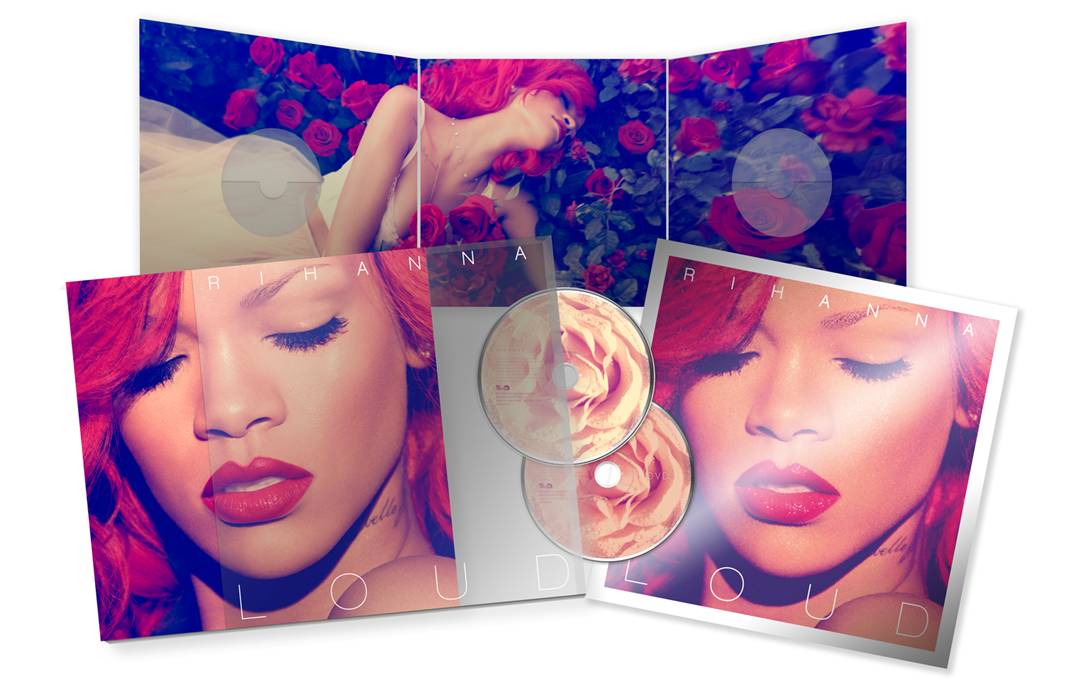
In this digipak just like the artist's Katy Perry's below, there is a picture that has been placed among other panels with Rihanna laying across a bed of roses.
The colour red is also used as a theme as the artist's hair and lips which can represent the danger, love, desire and power of which the album could be based upon.
Rihanna's face is the subject of the front cover which emphasizes her beauty which is also constructed as the 'Star- Image'; this is something that I will be using in my own digipak to illustrate who the artist is and therefore his/her/their audience should easily recognise the the album cover.


The XX- Coexist
What I like about this digipak is the simplicity of the design but it is also effective as everything is based on the chrome base of the 'X'. Because the artist's genre of work is 'Indie'- mainly electronic and house which then reflects the individuality of having a basic, original and different digipak. However for my digipack, I don't think I would be making it such a minimalist design as our artist's style of music is a bit more quirky and I wanted to include this and make it the basis of my digipak.
The writing used in this reflects what the theme is based on- candy; we can see this is many places such has what the artist is laying on 'clouds of candyfloss' and the writing of the artists' name looks as if it is in the style of icing.
The second part of the writing in 'Teenage Dream' above, is in the colours of a candy-cane and this is also used on the back cover (in substitute of the 'o') where the song titles are written and also on the disk on the left below.

Friday, 8 January 2016
Existing Magazine Adverts Analysis

Marina And The Diamonds's Magazine Advert is very simple and only includes the basic's, the name of her album, EP and the date it is out- with the music producer's company logo at the bottom.
However because the writing is so bold and big; in the 21st century- due to digital technology and the change of how the English language and content is displayed and changed, the less the writing the more likely the reader will take their time to read the advert.

Jessie J's Magazine Advert includes only one more features, a website address to purchase the cd and some advisement and merch such as posters, t-shirts and other items.
Although it includes only one other feature, the advert looks vibrant and interesting to read, with a variety of colours that each text have with a colour palette of gold, black and white.

What I like about the Green Day's Magazine Advert is that it includes everything from dates of singles to when the album is out, the song listings that is included on the album to a picture of the album in the bottom right corner of the advert.
A variety of font adds to how eye catching this Magazine Advert looks and the picture at the top with writing at the bottom makes the ad on a whole a lot more interesting and because the text is all capitalised, makes it easier for the audience to read.
Also the red text on a page with a dark background also makes it easier for the reader to stop flicking through pages and stop to see what the advert is actually about.
Subscribe to:
Posts (Atom)