Rihanna- Loud
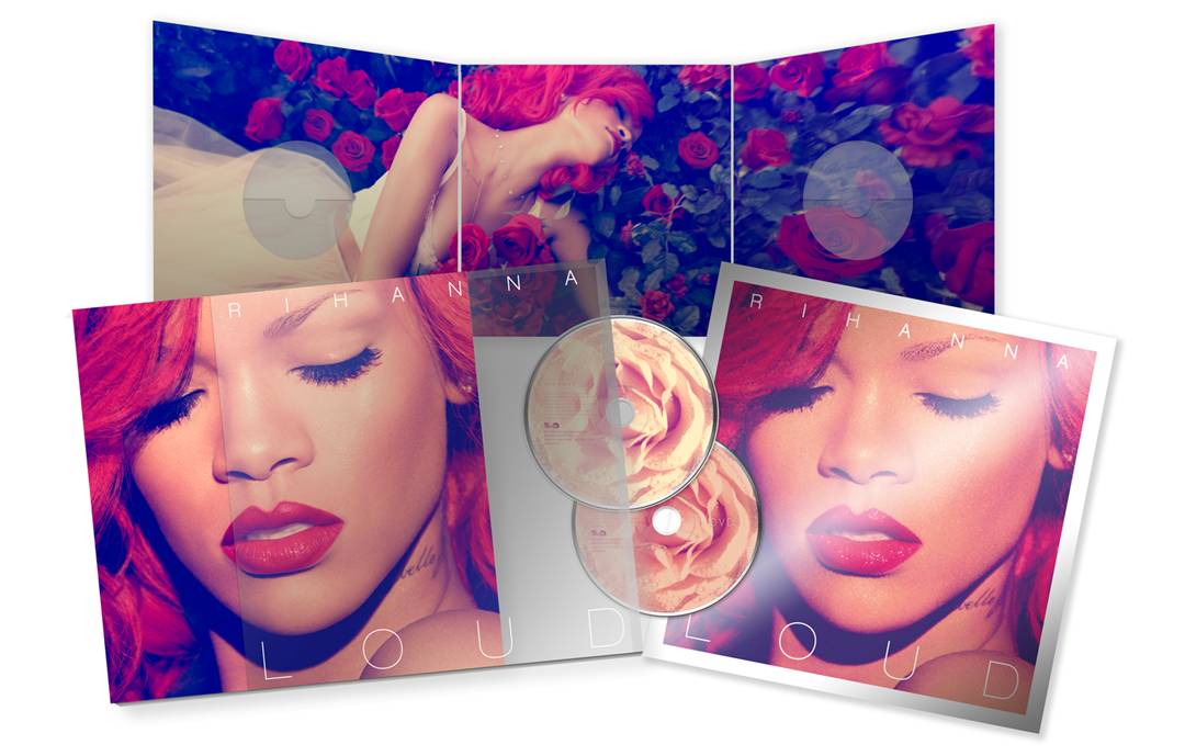
In this digipak just like the artist's Katy Perry's below, there is a picture that has been placed among other panels with Rihanna laying across a bed of roses.
The colour red is also used as a theme as the artist's hair and lips which can represent the danger, love, desire and power of which the album could be based upon.
Rihanna's face is the subject of the front cover which emphasizes her beauty which is also constructed as the 'Star- Image'; this is something that I will be using in my own digipak to illustrate who the artist is and therefore his/her/their audience should easily recognise the the album cover.


The XX- Coexist
What I like about this digipak is the simplicity of the design but it is also effective as everything is based on the chrome base of the 'X'. Because the artist's genre of work is 'Indie'- mainly electronic and house which then reflects the individuality of having a basic, original and different digipak. However for my digipack, I don't think I would be making it such a minimalist design as our artist's style of music is a bit more quirky and I wanted to include this and make it the basis of my digipak.
The writing used in this reflects what the theme is based on- candy; we can see this is many places such has what the artist is laying on 'clouds of candyfloss' and the writing of the artists' name looks as if it is in the style of icing.
The second part of the writing in 'Teenage Dream' above, is in the colours of a candy-cane and this is also used on the back cover (in substitute of the 'o') where the song titles are written and also on the disk on the left below.


No comments:
Post a Comment