
Sunday, 31 January 2016

Saturday, 30 January 2016
Digipaks From Other Artists Analysis
Rihanna- Loud
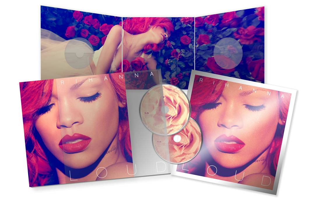
In this digipak just like the artist's Katy Perry's below, there is a picture that has been placed among other panels with Rihanna laying across a bed of roses.
The colour red is also used as a theme as the artist's hair and lips which can represent the danger, love, desire and power of which the album could be based upon.
Rihanna's face is the subject of the front cover which emphasizes her beauty which is also constructed as the 'Star- Image'; this is something that I will be using in my own digipak to illustrate who the artist is and therefore his/her/their audience should easily recognise the the album cover.


The XX- Coexist
What I like about this digipak is the simplicity of the design but it is also effective as everything is based on the chrome base of the 'X'. Because the artist's genre of work is 'Indie'- mainly electronic and house which then reflects the individuality of having a basic, original and different digipak. However for my digipack, I don't think I would be making it such a minimalist design as our artist's style of music is a bit more quirky and I wanted to include this and make it the basis of my digipak.
The writing used in this reflects what the theme is based on- candy; we can see this is many places such has what the artist is laying on 'clouds of candyfloss' and the writing of the artists' name looks as if it is in the style of icing.
The second part of the writing in 'Teenage Dream' above, is in the colours of a candy-cane and this is also used on the back cover (in substitute of the 'o') where the song titles are written and also on the disk on the left below.

Friday, 8 January 2016
Existing Magazine Adverts Analysis

Marina And The Diamonds's Magazine Advert is very simple and only includes the basic's, the name of her album, EP and the date it is out- with the music producer's company logo at the bottom.
However because the writing is so bold and big; in the 21st century- due to digital technology and the change of how the English language and content is displayed and changed, the less the writing the more likely the reader will take their time to read the advert.

Jessie J's Magazine Advert includes only one more features, a website address to purchase the cd and some advisement and merch such as posters, t-shirts and other items.
Although it includes only one other feature, the advert looks vibrant and interesting to read, with a variety of colours that each text have with a colour palette of gold, black and white.

What I like about the Green Day's Magazine Advert is that it includes everything from dates of singles to when the album is out, the song listings that is included on the album to a picture of the album in the bottom right corner of the advert.
A variety of font adds to how eye catching this Magazine Advert looks and the picture at the top with writing at the bottom makes the ad on a whole a lot more interesting and because the text is all capitalised, makes it easier for the audience to read.
Also the red text on a page with a dark background also makes it easier for the reader to stop flicking through pages and stop to see what the advert is actually about.
Subscribe to:
Posts (Atom)